
How To Design a Dashboard with Elements Dashboard Designer (v5.18 and earlier)
Note: This article applies to Elements v5.18 and earlier only. Newer versions of Elements offer a dashboard design experience directly within the browser, with no need to use a separate downloaded dashboard designer application. If you are running Elements 5.19 or later, please see the Introduction to Dashboards article for more information.
Download the Designer
The Dashboard designer is a Windows program available from our Upgrade Pack forums (choose the correct version, and scroll down to Media section). Download the Analytics Dashboard Designer zip file and extract the content to a suitable location.
Tip: The Dashboard Designer is released with the same version scheme as Elements itself and therefore needs to be upgraded when Elements is upgraded. During times of major version change it is advisable to have a separate (newer) Designer for use against (for example) the Development server at the same time and potentially on the same computer as the (older) Designer for (for example) test and production use.
Creating a Dashboard
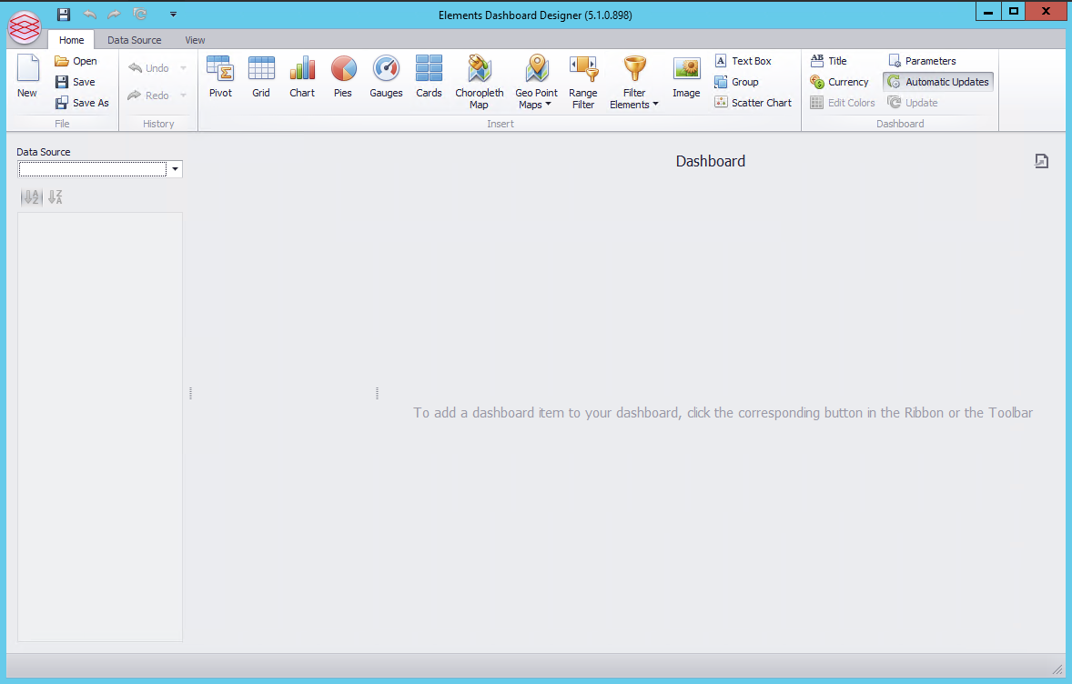
Simply double-click on Reporting.Analytics.DashboardDesigner.exe that you find in the downloaded media to start the Elements Dashboard Designer:
Connecting to the Elements Analytics Database and Elements Datacube
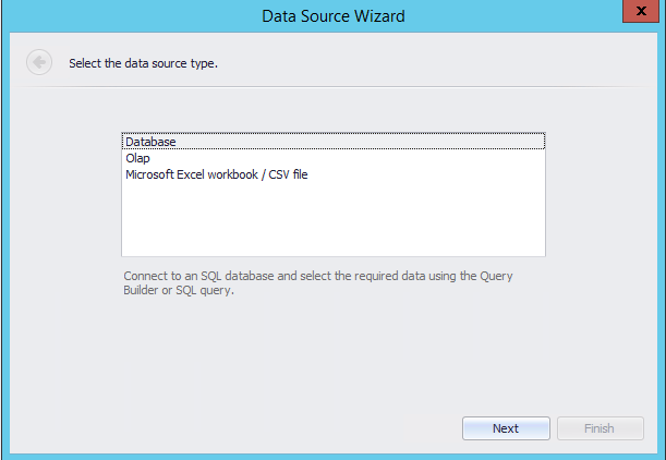
Create a New Dashboard and select Olap (note that XLS and CSV are not supported) and click Next:
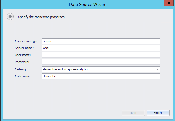
Specify the connection properties:
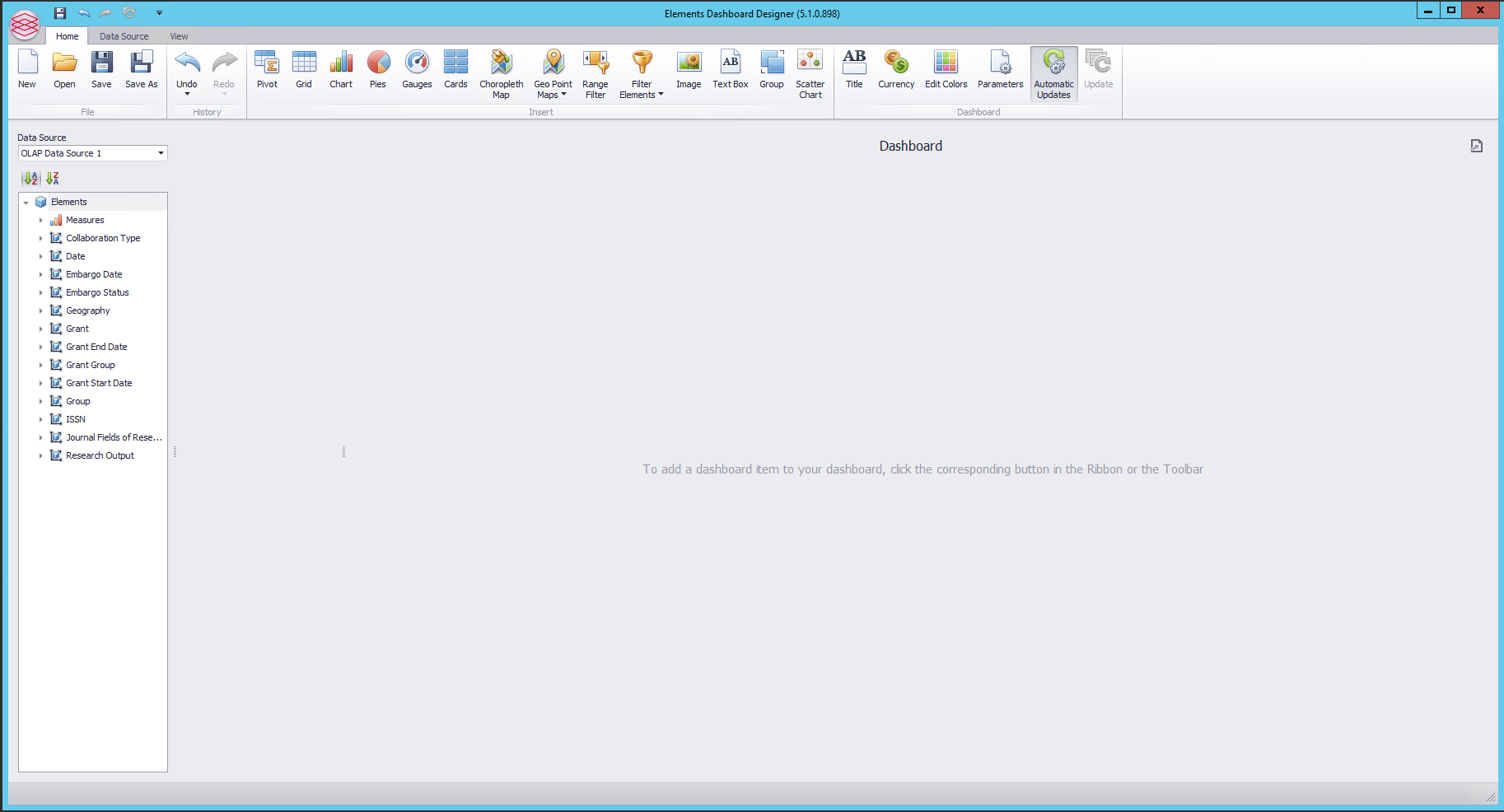
The new data source cube should load in the left-hand panel:
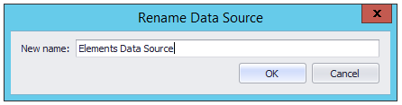
Next, modify the name of the Data Source to allow it to be used correctly by Elements:
Change the ribbon tool to the Data Source menu.
From there, select the connection "OLAP Data Source 1" from the drop-down list.
Select "Rename" from the ribbon toolbar, and change the name to "Elements Data Source". This allows Elements to correctly migrate the connection string if you later move the location of your analytics database.
Create a sample dashboard
Change the ribbon to the Home tab.
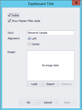
Click on the "Title " icon in the toolbar - in the Dashboard section of the ribbon.
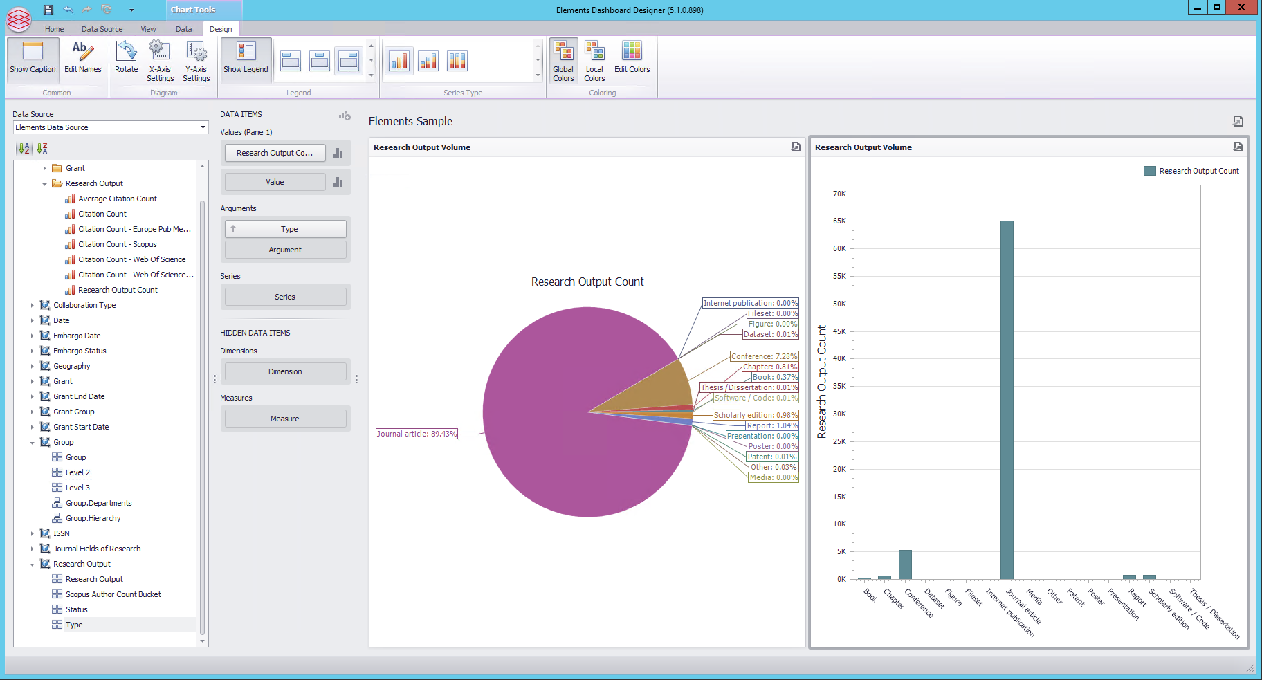
Click on the Pies icon in the toolbar to add a single pie chart, which will be default fill the entire authoring area (actual chart won't be shown yet), It will initially be called "Pies 1". Right click on it, and select "Edit Names". Change the Dashboard item name to "Research Output Volume" for example.
The toolbar down the left shows available Measures (the things we are counting) and Dimensions (the things we may wish to be grouping by). An example measure is the "Research Output Count" under the "Research Output" grouping.
Drag the "Research Output Count" to the Values section of the Data Items column to add data to the pie chart:
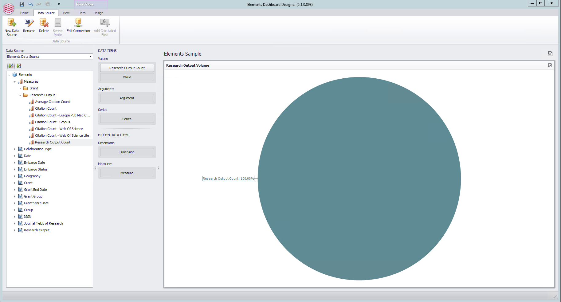
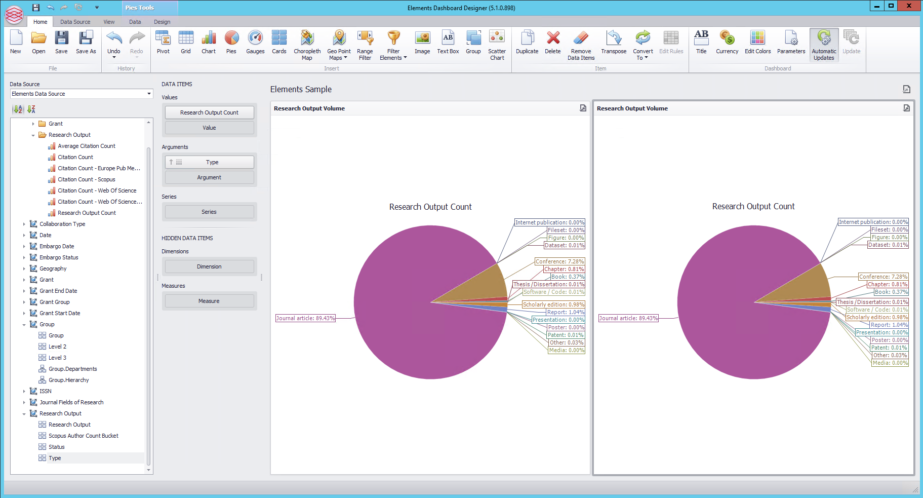
Expand the Research Output dimension, drag the "Type" dimension attribute to the Arguments area. This will have the effect of using the Research Output Type as the slices of the pie.
Make another chart by right-clicking and selecting Duplicate:
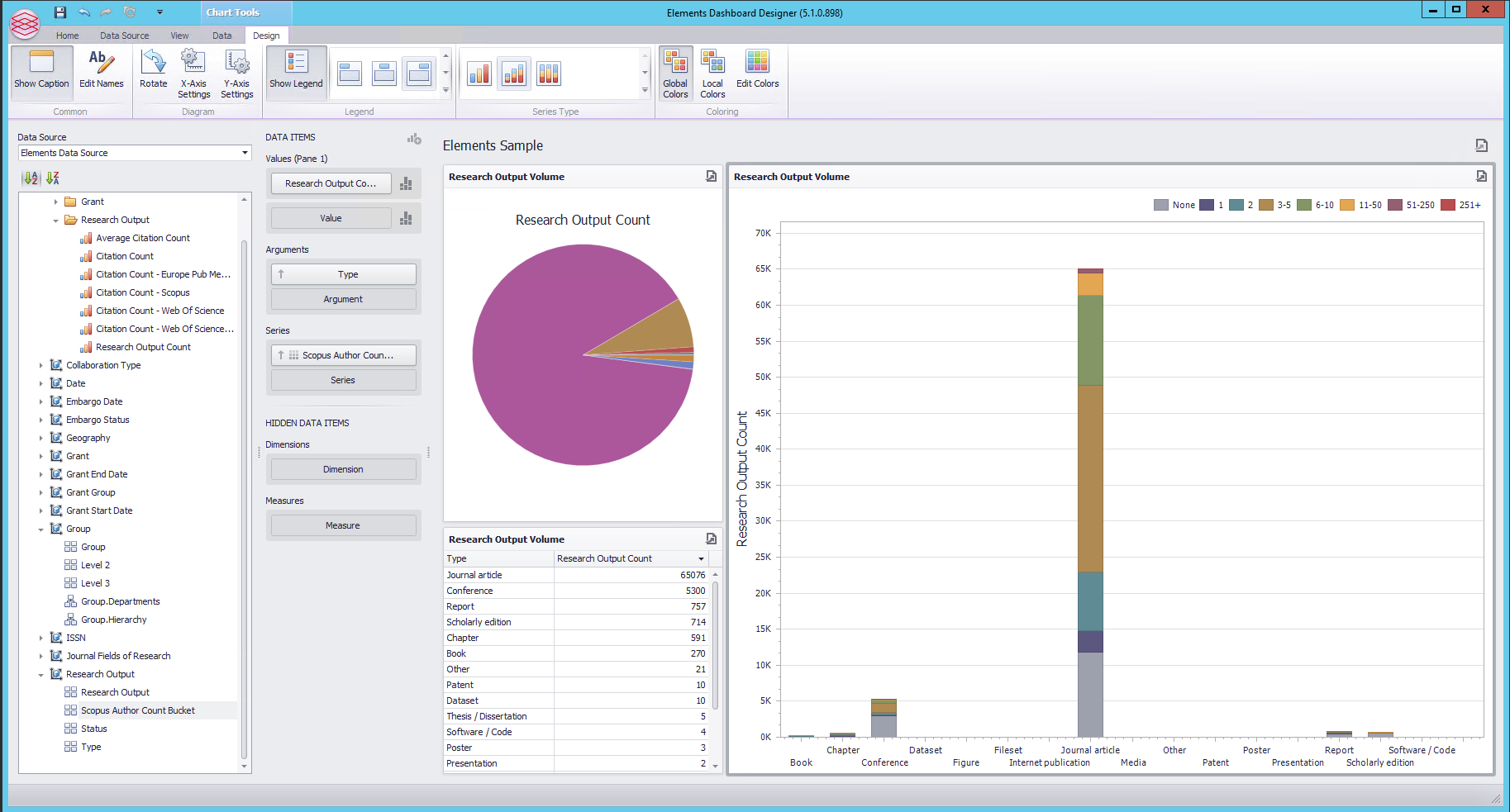
Select the Design ribbon along the top of the user interface to change the available options. Select the right hand pie chart, right click and select Convert To, and select Chart:
Duplicate the Pie Chart again and right click the resulting second pie chart, choose Convert To and select Grid.
Drag the Grid to the bottom left of the dashboard,.
Drag the edge of the Research output Volume chart to make it larger, at the expense of shrinking the pie chart and Grid.
Select the Pie Chart and click on the the Data Labels icons to turn off labels.
Select the Grid and then from within the DATA ITEMS column, click on the Research Output Cou... near the sigma which will result in a new submenu. Click on Format. Change the format to Number -> Ones and 0 decimal place.
Select the bar chart again now, and from the Series Type area of the ribbon, chose the second option for a stacked bar chart.
From the Data Source browser on the left, drag the Scopus Author Count Bucket attribute of the Research Output dimension to the series of the bar chart.
The resulting dashboard should now look like :
Click the Home ribbon - click on the Filter Elements and select Tree View. Right click and select Edit Names to change the name to Filter Group(s). Expand the Group dimension on the left and drag Group Hierarchy onto the Dimensions area of the new Filter:
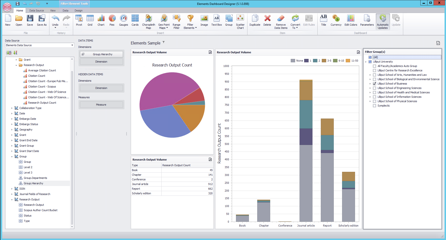
Add a new Tree View Filter , expand the Date dimension and drag the Calendar Year attribute onto the filter, Right click on the new year filter and select Edit Filter. This allows you to pre-select which years will be included in the checkbox list of years to filter by in the dashboard. Clear the Show All box and choose only the years you wish to include:
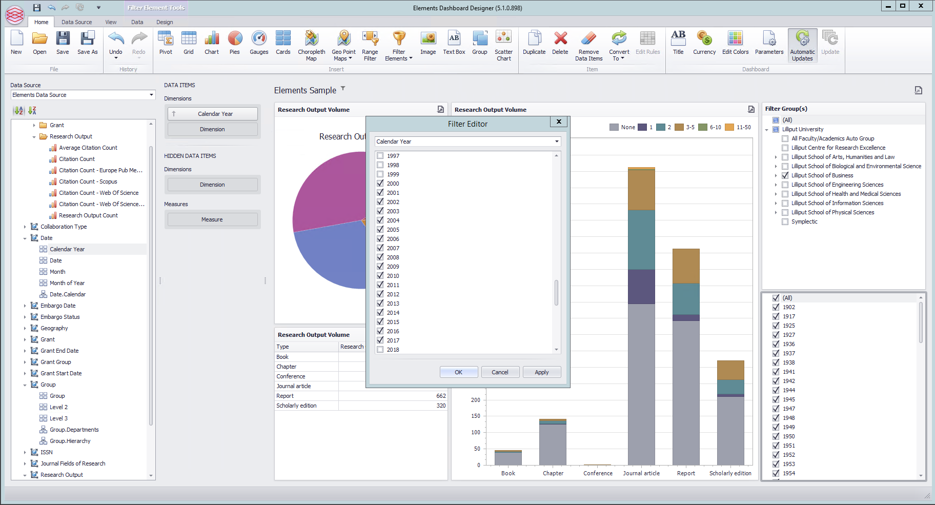
Click OK.
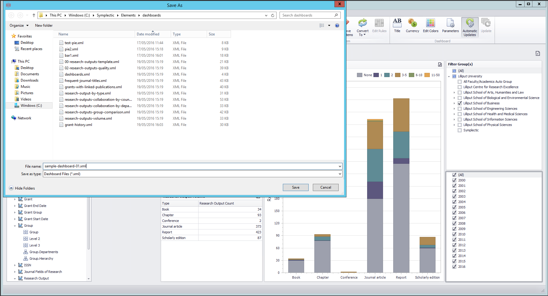
Now Save your new dashboard, giving it a name, and remembering the folder you have saved it in.
Manage Dashboards
Registering Your Dashboard in Elements and Sharing it with Others. Navigate to Reporting > Configure Reporting > Manage Dashboards (in 5.x: Module Admin > Dashboards > Manage Dashboards), and click on Create a new Dashboard.
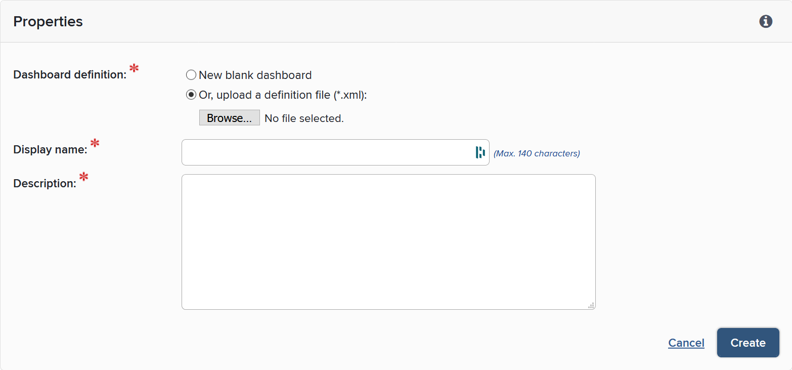
Upload your XML Dashboard definition file and fill out the name and description and register. More details are available on the Manage Dashboards article.
You will then see the Manage Dashboards page which will show a table of each dashboard. For the row that has just been added, ensure the Enabled box is checked, and use the Edit Viewers link to control who the dashboard should be shared with.