
Hello, World! A custom SQL dashboard
This article refers to dashboard functionality in Elements v5.19 and later. Before this version, dashboards did not support use of the Reporting Database and could not be designed within the browser.
This article walks you through the process of creating a new custom SQL-based dashboard in Elements. It aims to leave you with familiarity of the basics of how to create, design and save a new dashboard that draws its data from the Elements Reporting Database, and finally deploy the dashboard to the appropriate end-users.
This article assumes you are already familiar with the contents of the Introduction to Dashboards support article.
Navigate to Search & Reporting > Configure Reporting > Create a New Hub Report.
Navigate to Reporting > Configure Reporting > Create a New Dashboard.Create a new blank dashboard
Note: If your organisation does not license the Analytics Module you will not be able to create new dashboard.
This will open up the dashboard properties page, where you need to provide a few pieces of information about your new dashboard.
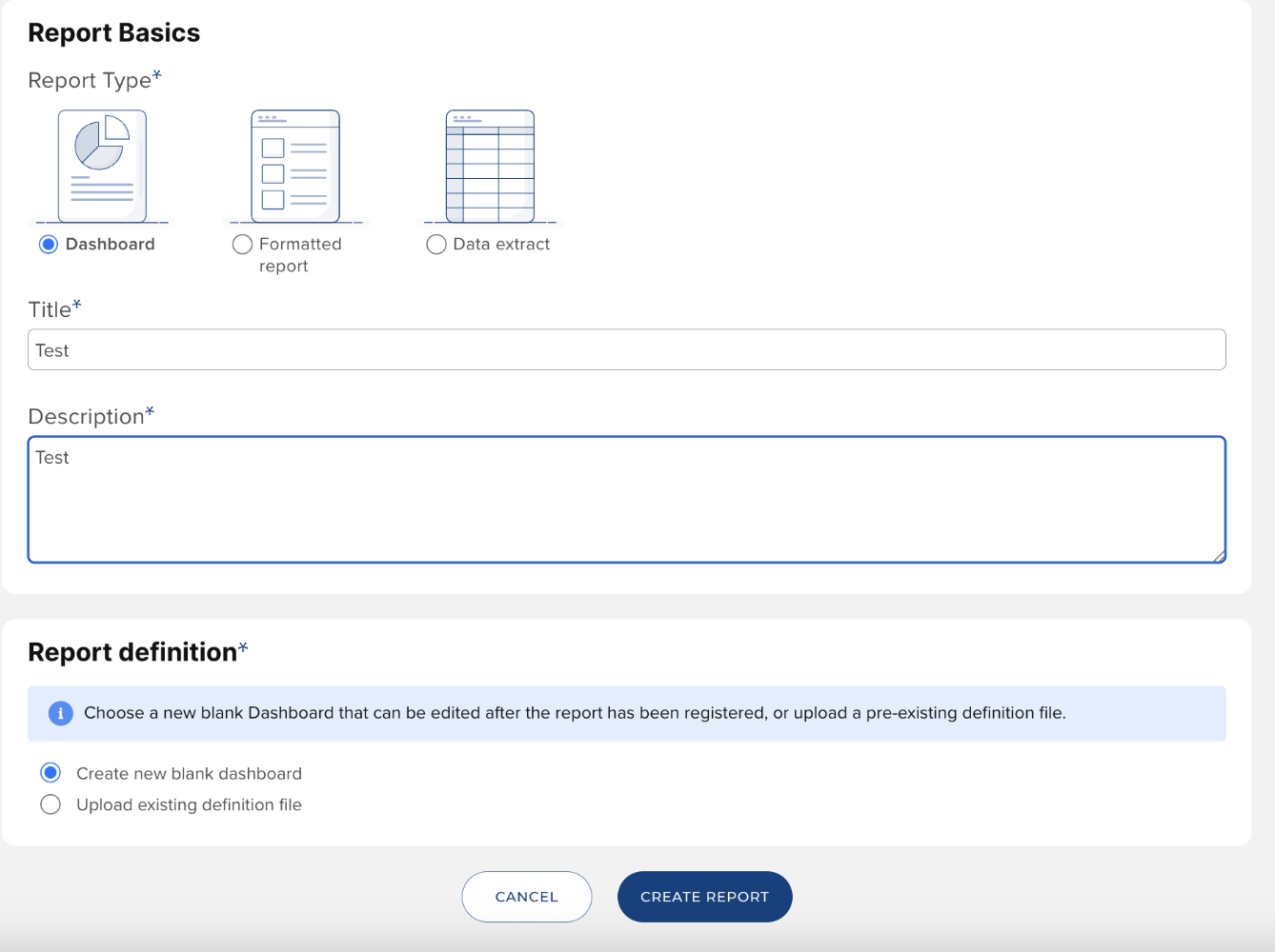
Keep the New Blank Dashboard option selected. Provide a display name for your dashboard, and a description. The name and description will be made available to all users to whom you later provide access to the dashboard. Click the Create button when you have finished.
You will then see your new blank dashboard within the system's list of dashboards. At this point, the dashboard can only be viewed by those with similar rights to you: Dashboard Administrators.
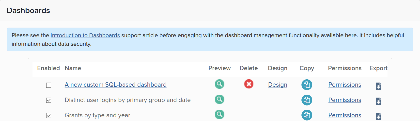
Click on the Design hyperlink to open the dashboard designer in a new browser tab. Once the designer has loaded, it may show a popup message reminding you of the need to regularly save your dashboard. This is important, as it is currently possible for you to lose unsaved changes if you allow your login session to expire through inactivity.
Select data
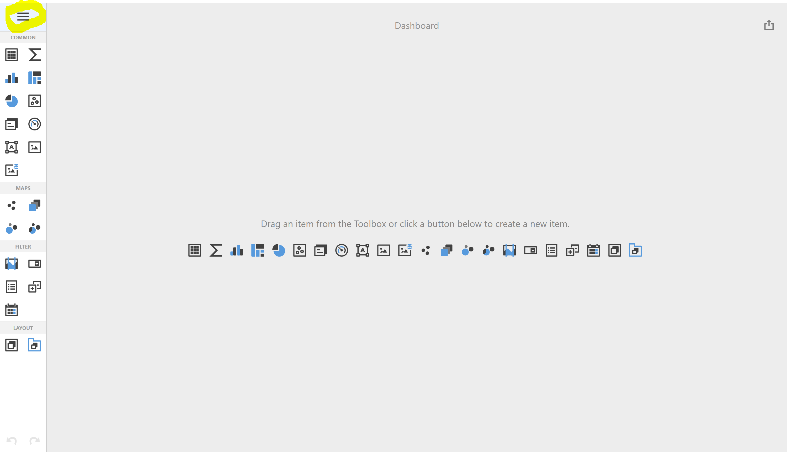
After dismissing the popup, you will see the design tools down the left and the design surface in the middle of the page. The designer's menu button is highlighted below.
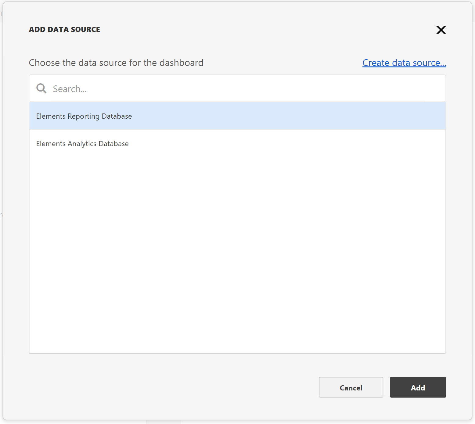
We are going to configure the dashboard to select some interesting data from the Elements Reporting Database. We will later bind this data to items on the dashboard in order to visualise it. Click on the menu button and select Data Sources. From there select the Add hyperlink to add a data source to the dashboard.
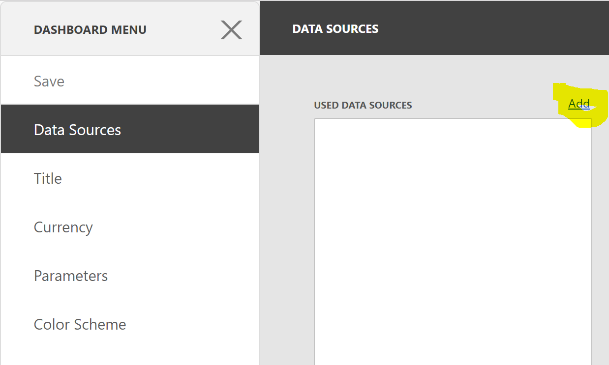
Elements supports just two data sources for dashboards. This article focuses on using the Elements Reporting Database as the data source (and for which SQL-based queries are appropriate). Select the Elements Reporting Database data source and click the Add button. There is an option to "Create Data Source...", but this does not offer the ability to choose a data source other than the two supported data sources. Choosing that option will currently just permit you to create a new data source using one of the two underlying data connections used by the existing supported data sources. It doesn't get you anywhere new.
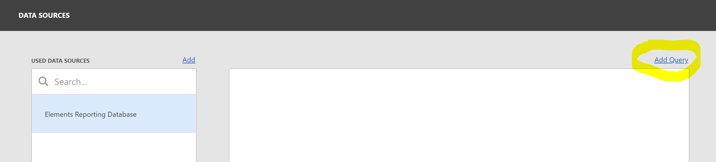
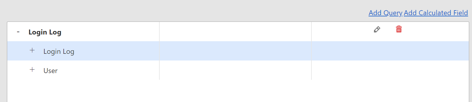
Once you have added the Elements Reporting Database as the data source for your dashboard, you need to click on Add Query in order to select data from the database.
This presents you with the dashboard data source wizard, which provides you with a few choices for how you wish to select your data from the database.
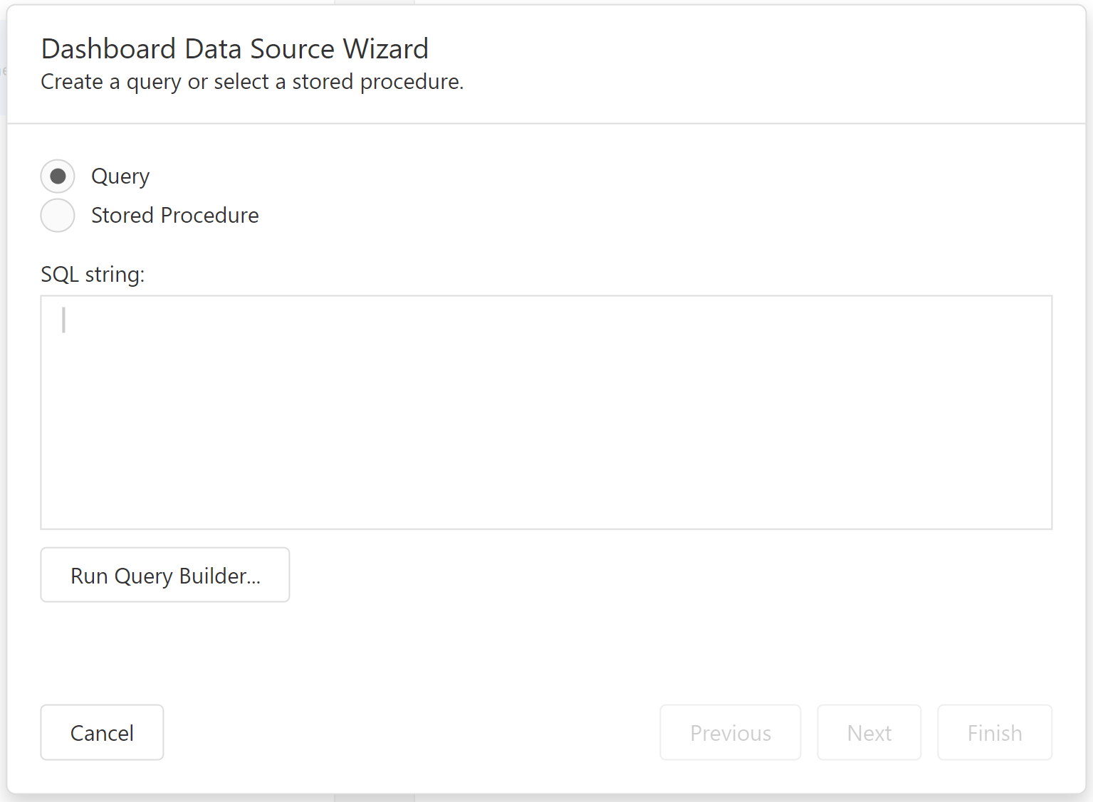
Click the "Run Query Builder..." button.
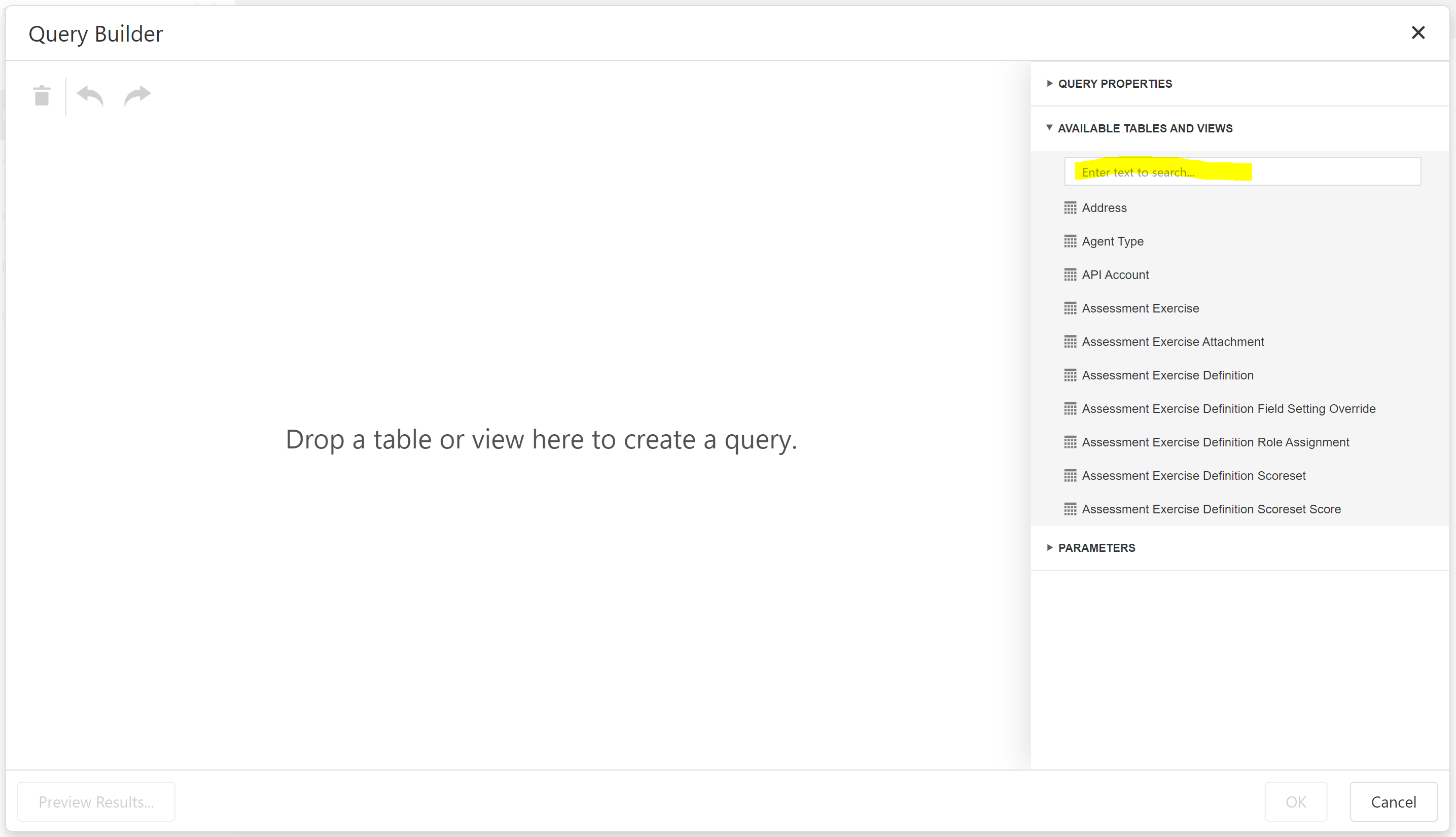
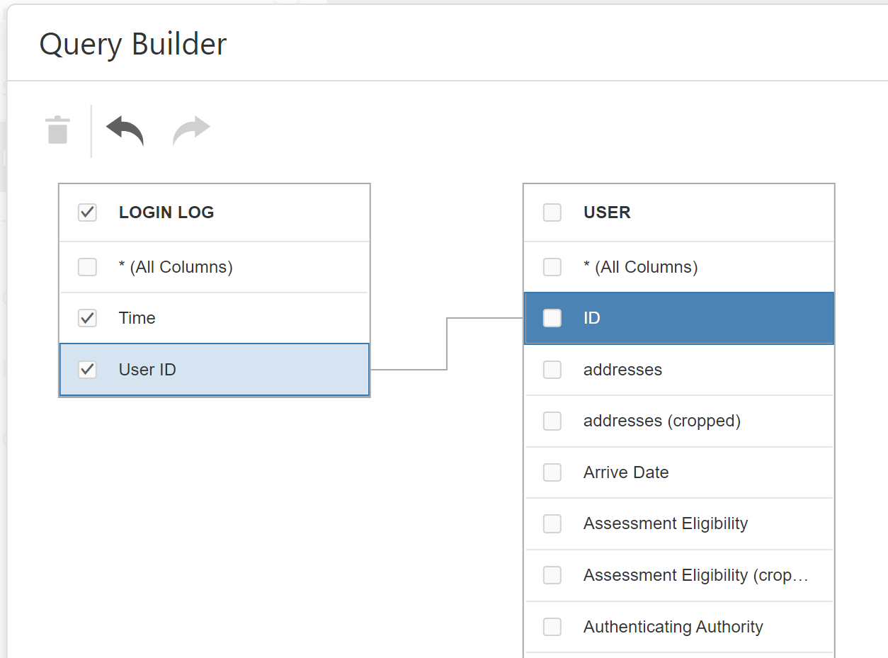
Enter the text "Login Log" into the table search text box, then double-click on the Login Log table in the result section below it, or drag that table to the design surface of the query builder. Check the Time and User ID columns in the table that is displayed.
Next, Look for the User table and add that to the design surface, too. Select its Primary Group Descriptor column. Finally, drag the User ID column of the Login Log table to the ID column if the User table. This tells the Query Designer how the data rows in the two tables are related: for every row in the Login Log table, the relevant row in the User table is the row whose ID matches the User ID column of the Login Log. Your query designer surface should now something look like this:
Click the OK button to go back to the data source wizard dialogue. It will show the SQL query corresponding to the query you designed in the query designer.
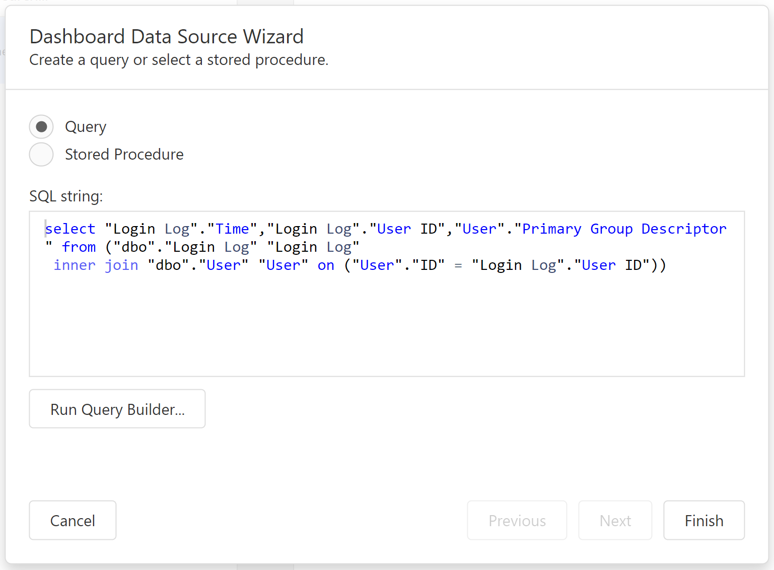
If you wanted to, you could copy/paste this text into your own SQL query designer, such as SQL Server Management Studio, and work on it further, before pasting it back into this window. Click the Finish button. You will now be able to see the query you have authored. Should you need to edit the query again, you can do so from here:
Create a chart
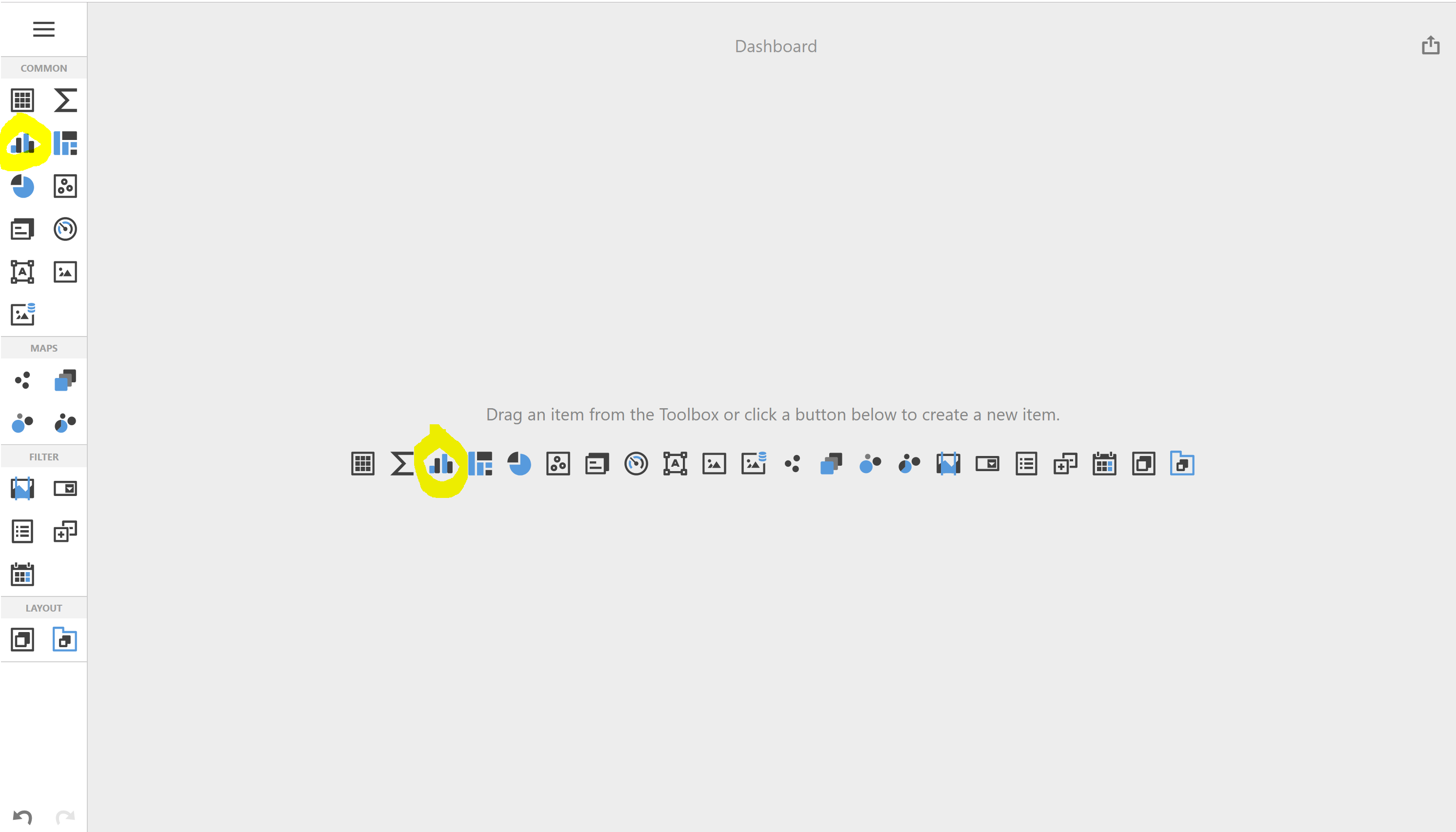
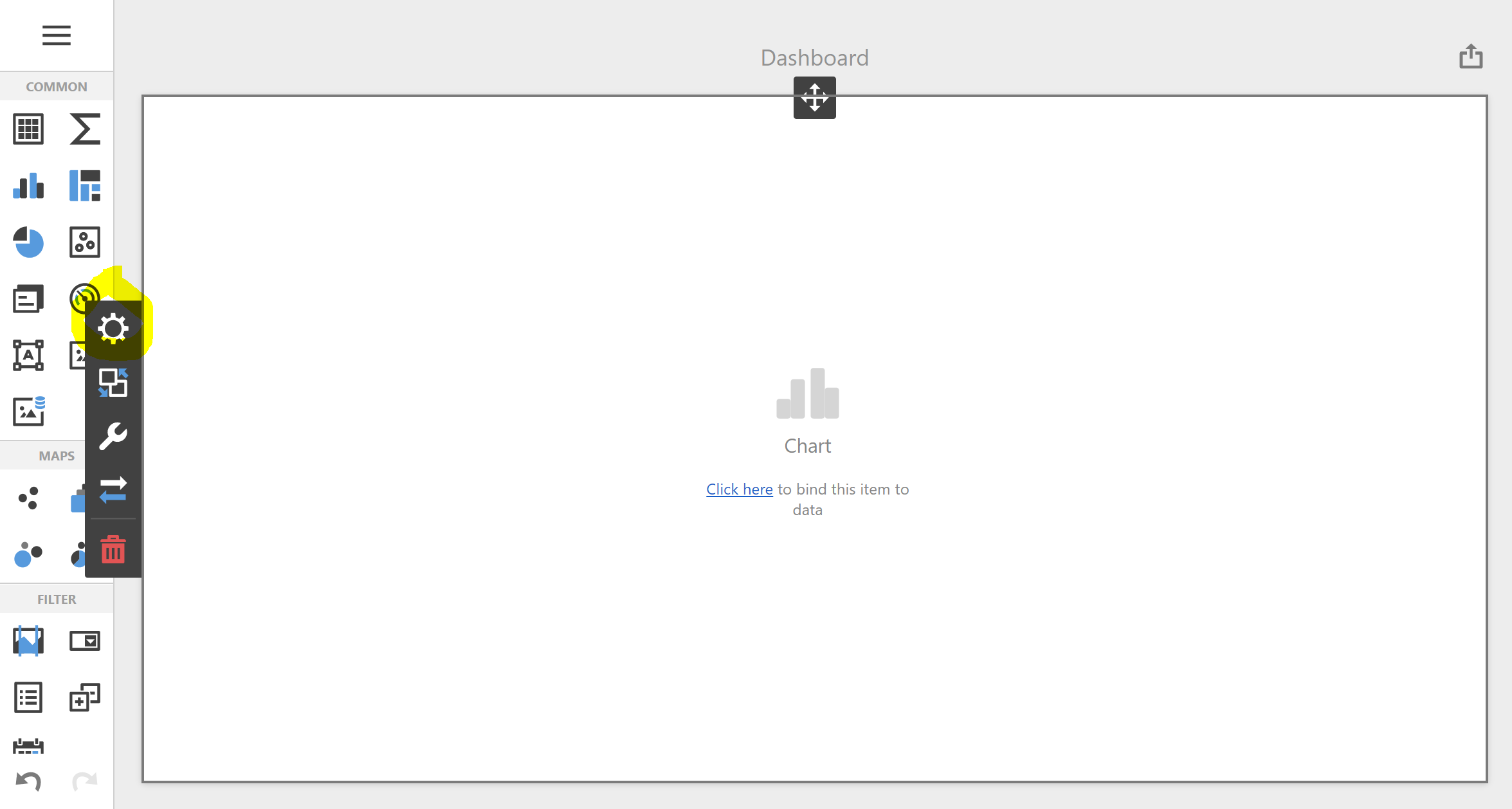
Now is a good time to save your changes. Click the Save button in the dashboard menu, which should still be open on the left of the window. This will cause the menu to close. Next, add a bar chart item to the dashboard by clicking on either instance of the bar chart icon:
The designer will now show an empty bar chart item that takes up the whole of the design surface of the dashboard. It is now our job to bind the bar chart to the data query that we earlier configured. Click on the cog icon that appears when mousing over the chart item to open the data binding interface for the item, or click the "Click here to bind this item to data" hyperlink in the chart item's area.
We would like our bar chart to count the logins of our users over time. To do this, we need to think about how a bar chart should deal with the various columns in our query. But first, we need to ensure that the chart is bound to the correct query (in general, we might have added more than one query to the dashboard).
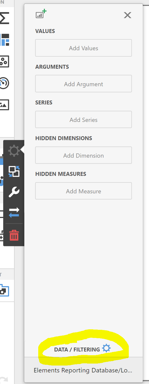
Click on the Data / Filtering link at the bottom of the binding configuration area. This will open up and provide information showing us that the chart is bound to the query we authored earlier.
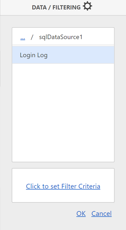
Click Cancel.
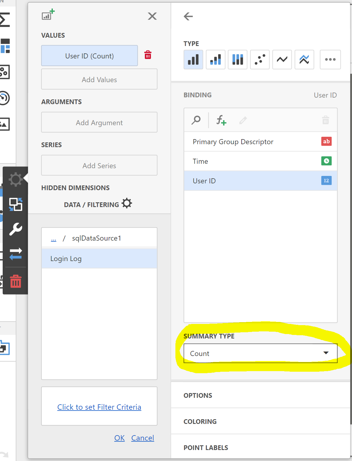
We want the bar chart to count instances of values in the User ID column (actually, any column would do, but we choose User ID in case we later want to make subtle changes to how we count things). Click on the Add Value box under the Values section of the binding configuration area. "Values" are the things we typically want to count, add, average or otherwise aggregate. In this case we are going to count instances of values of User ID.
After clicking the Add Value box, select the User ID column and then ensure the Count option is selected under the Summary Type section. This ensures the bar chart's bars will count rows in the results set (more accurately it will count the number of rows with a non-null value for User ID). The default option of Sum would instead cause the bar chart's bar heights to represent the sum the IDs of users, which would not make sense for our purposes. This ability to subtly vary what is "measured" in a dashboard is both interesting and important when designing your own dashboards.
We would like a one-dimensional bar chart where the dimension (grouping) is time. To configure a time-based grouping you should click the Add Argument button in the Arguments section of the binding configuration area. The designer often refers to dimensions of analysis as "Arguments". Then, select the Time column of the query. The designer notices that the Time column contains time values, and offers us a drop-down choice of time group intervals. Choose Month-Year to cause the bar chart to group login events by month and year.
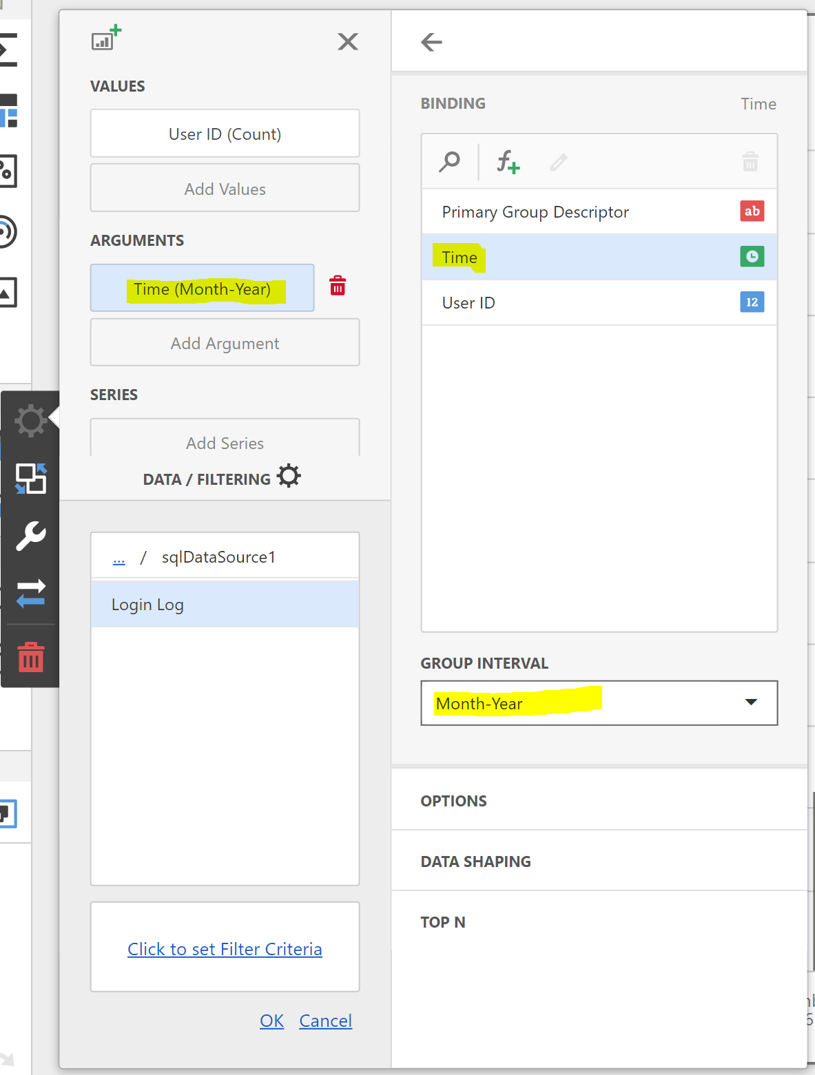
The ability to configure a dimensional binding on your chart likewise provides you with a lot of power in analysing data. Close the binding control area to view the dashboard you have designed.
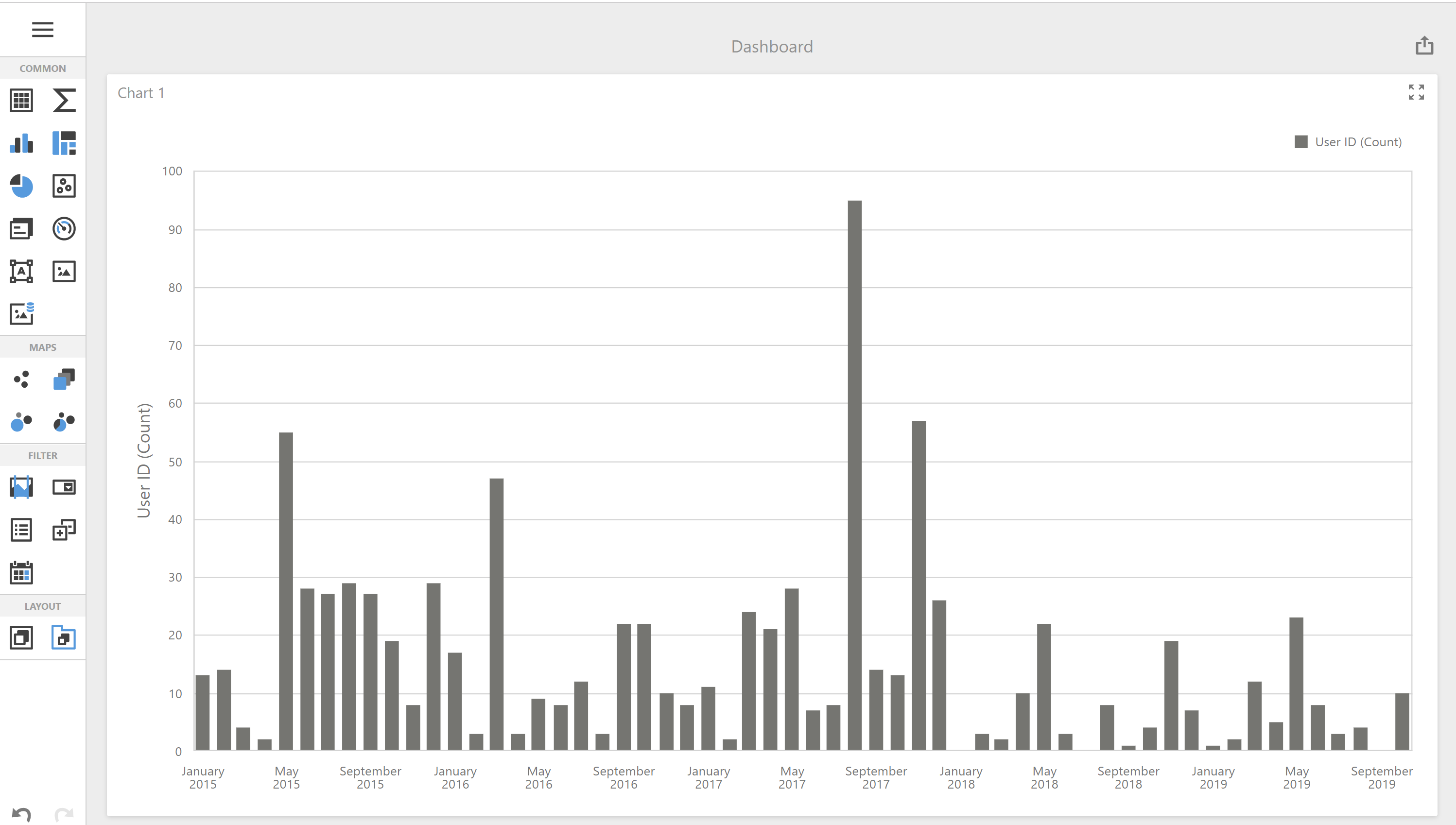
This dashboard is now measuring the number of login events by users of the system in each month of history of usage. A useful visualisation for tracking system engagement!
But what if instead, you wanted to count the number of different users engaging with the system (where three logins in the same month by the same user counts only once), instead of the number of logins (where three logins in the same month by the same user counts three times)? Let's modify the dashboard to additionally measure this definition of engagement.
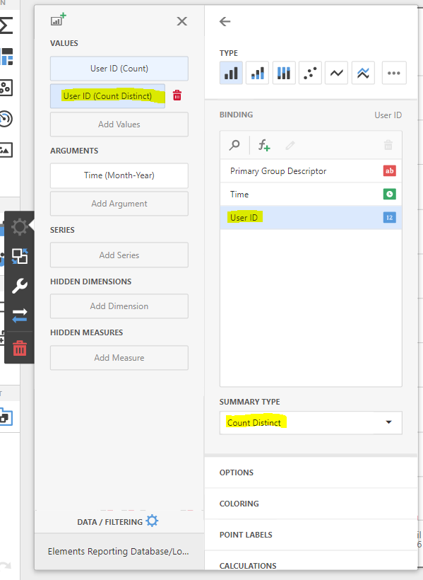
Reopen the binding configuration area by clicking on the cog symbol that appears to the left of the chart area when hovering over the chart. Click on the Add Values button, again selecting the User ID column of the bound query. From the Summary Type drop-down, choose the Count Distinct measure.
This will alter the way the graph is drawn to cause the second series to be drawn over the first. This gives the following pleasing representation to the chart.
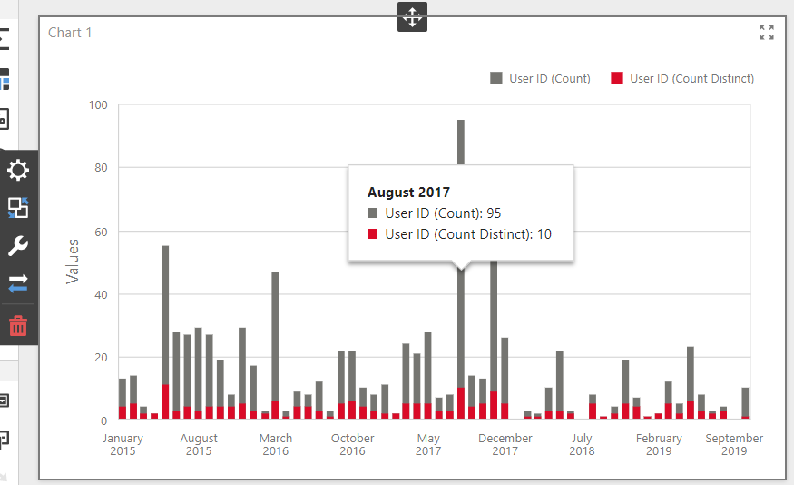
You can now see the total number of logins and the total number of different users logging in in each month.
Presentational changes
You can also see in the screenshot above the tooltip that is automatically shown by the chart when mousing over a bar, and the legend for the two series. These can be very helpful to viewers. By default, they show the name(s) of the bound column(s) and the function you chose when measuring them, but you can alter the display name of each binding to better describe what is being shown. Reopen the binding configuration and select the "User ID (Count)" value. Open the Options section to its right and enter the word "Logins" into the Caption textbox.
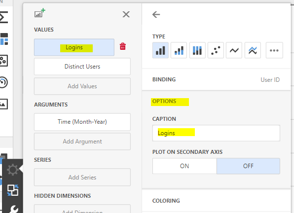
Likewise, set the caption of the "User ID (Distinct Count)" binding to "Distinct Users". These captions will now be used by the dashboard as the names of the two graphed series.
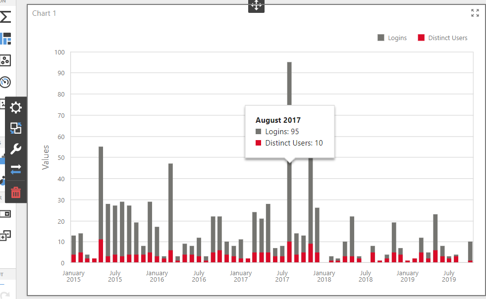
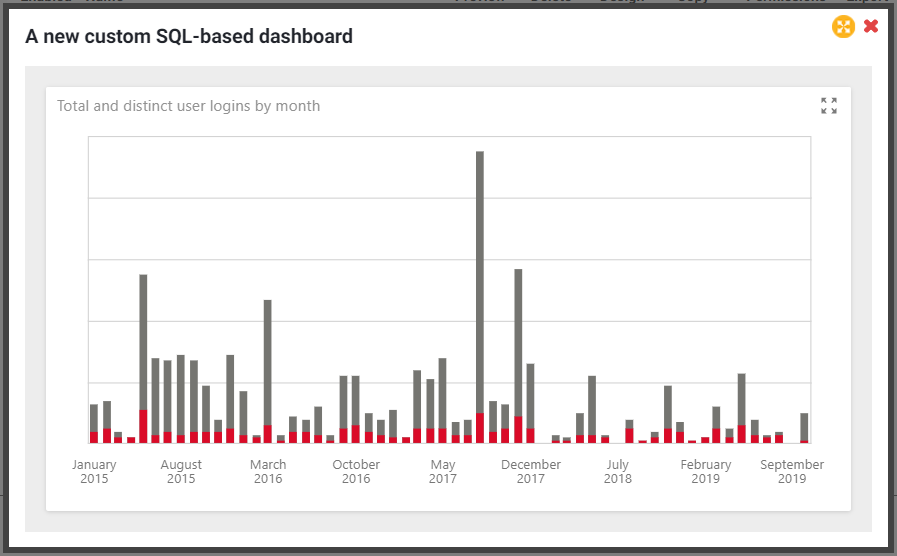
Set the title of the chart by opening its Options menu (the spanner icon to the left of the chart) and setting the Caption there to "Total and distinct user logins by month". Remove the y-axis label by opening the Axis Y section of the same Options menu, switching the Visible toggle to Off. You can go further by hiding the dashboard title (which is separate to the chart title) by opening the dashboard menu (top left), selecting the Title submenu and unchecking the Visible checkbox. For maximal decluttering, try also removing the legend (using the Legend submenu of the chart Options menu).
Save the dashboard
Don't forget to save your changes by selecting the Save menu option from the main dashboard menu. Then close the browser tab and navigate back to Search & Reporting > Reporting > Dashboards.
Dashboard deployment
You should now be able to preview the dashboard by clicking the Preview button against your dashboard on the Manage Dashboards page.
Consider with whom you should share the dashboard. As well as usefulness to the audience, your main concern should be around data security. Who should be permitted to view the dashboard? Please see the following article for more information on dashboard security and data privacy:
Click on the Permissions hyperlink next to your dashboard entry on the Manage Dashboards page. Navigate to Search & Reporting > Reporting > Dashboards. Select the 'Permissions' link and add users or groups as required.
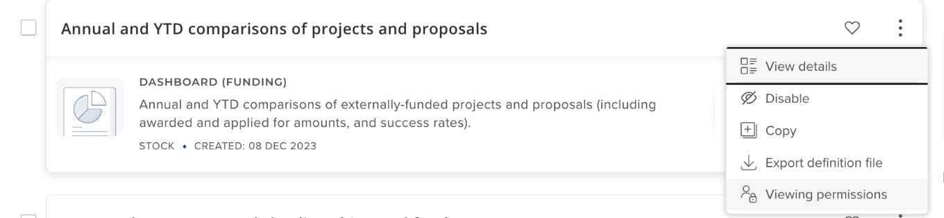
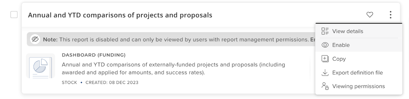
Now that the dashboard is designed and its permissions have been configured, you are in a position to "go live" with the dashboard, by checking the Enable button next to the dashboard entry on the Dashboards page.
Final steps
You have designed and deployed a custom dashboard, consuming data directly from the Reporting Database!
Update your upgrade project checklist
Now would be a good time to ensure your custom dashboard and the SQL you have authored within it features on your institution's Elements upgrade acceptance tests checklist - your institution should work through this checklist on each future upgrade of Elements to ensure your dashboard still functions as intended, and in particular with respect to data security.
This will give you the opportunity to maintain your custom dashboard in working order on newer versions of Elements, should any changes become necessary.
Consider sharing your dashboard with the Elements community
Elements supports the export and import of dashboard definitions as XML files. In this way, dashboards can be downloaded from one Elements system and then re-uploaded into an entirely different Elements instance with minimal effort. This is something we really hope clients will take full advantage of. We encourage you to share your creation with other members of the Elements community via the Symplectic figshare community portal: