Advanced topics in Dashboards
This article refers to dashboard functionality in Elements v5.19 and later. Before this version, dashboards did not support use of the Reporting Database and could not be designed within the browser. However, many of the same concepts also apply to the more limited dashboard functionality that was available before v5.19.
This article discusses some advanced topics relating to the design of custom dashboards in Elements, focusing almost exclusively on SQL-driven dashboards, which use the Reporting Database as their data source. Please note, the ability to design dashboards requires a license to the Analytics Module. Some of the content here is driven by the interesting observations we've made and techniques we've had to become familiar with at Symplectic during data analysis performed here. Sharing some of these experiences will hopefully be of use to you.
Interactive filters
Dashboards support the idea of multiple dashboard components. One visual component might be a bar chart, another might be a table of filter values related to the chart. Dashboards even support using one visual component as a filter for other visual components.
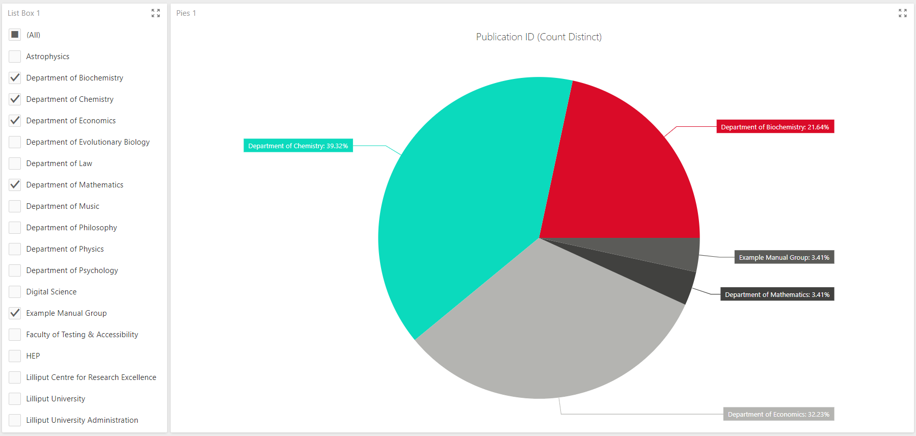
Let's build a simple dashboard that counts the number of publications claimed by your institution's users, optionally filtered by the set of primary groups in the system.
Create a new blank dashboard using the Reporting Database as its data source, and register the following SQL query for use:
SELECT	u.ID AS [User ID], g.[Name] AS [Group], r.[Publication ID]
FROM	[User] u
		JOIN [Group User Membership] gu ON gu.[User ID] = u.ID AND gu.[Is Primary] = 1
		JOIN [Group] g ON g.ID = gu.[Group ID]
		JOIN [Publication User Relationship] r ON r.[User ID] = u.ID
This query returns one row for each publication relationship in the system. Add a pie chart, binding its values to Publication ID (Count Distinct) and its arguments to Group. Then add a list box, binding its dimension to Group. Because the two visualisations are bound to the same dataset, and because the list box by default acts as a filtering control, the dashboard knows to automatically filter the pie chart to your selection of groups in the list box, in real-time. Any additional visualisations bound to the same dataset will be filtered in the same way.
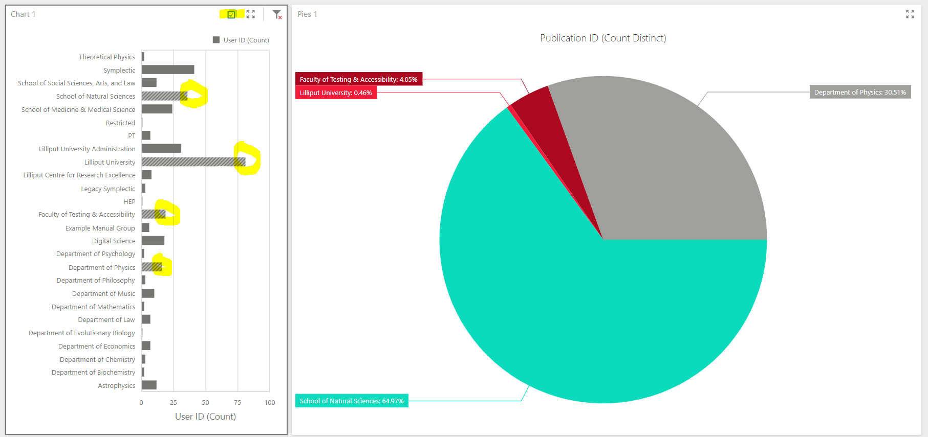
Now delete the list item visualisation and replace it with a bar chart. A bar chart is not usually used as a filtering control, but we're going to show one way this can be done. Keeping the original SQL query, register a new query as follows:
SELECT  u.ID AS [User ID], g.[Name] AS [Group]
FROM  [User] u
    JOIN [Group User Membership] gu ON gu.[User ID] = u.ID AND gu.[Is Primary] = 1
    JOIN [Group] g ON g.ID = gu.[Group ID]
This query can be used to count the number of users in each primary group. So can the original query, actually, but we'll use a different query to demonstrate how "cross-data-source" filtering can be achieved in the dashboard. Bind the new bar chart's values to User ID (Count), and its arguments to Group. Change the bar chart's settings to rotate the display so that the group names and bars are oriented horizontally for easier reading.
Next, use the Interactivity context menu on the bar chart to choose the Multiple mode for its Master Filter Mode behaviour. This tells the bar chart to act as a master filter for the whole dashboard, allowing selection of multiple filter values (bars in the bar chart) at the same time. Exiting the menu, you should be able to see that you can now select the individual bars in the chart, which become highlighted.
However, the selections are not yet acting as filters on your other visualisation, the pie chart. This is because the two visualisations are using data from different data queries. To enable the filtering behaviour of the bar chart to apply to the pie chart, open up the bar chart's Interactivity context menu and switch Cross-Data-Source Filtering to On. Now, whenever selecting a bar in the bar chart, your pie chart will filter to that group. To select multiple bars at the same time, toggle the Multi-Select checkbox at the top of the bar chart visualisation box. For cross-data-source filtering to function, the filtering and filtered properties need to be named identically in both the filtering and filtered chart items. In our case, the filtering [Group] property in the bar chart has the same name as the filtered [Group] property in the pie chart, so the cross-data-source filtering worked.
Intermediate aggregations (avoiding double-counting)
Let's create a dashboard that measures the sum of citation counts of publications associated with each 4-digit-code label from the Fields of Research ontology, with an interactive filter by group.
Create a new blank dashboard connected to the Reporting Database, and register the following query for binding to the dashboard:
SELECT  p.ID AS [Publication ID], l.Label, p.[Citation Count], g.[Name] AS [Group]
FROM  [Publication] p
    JOIN [Publication Label] l ON l.[Publication ID] = p.ID
    JOIN [Label Scheme] s ON s.ID = l.[Scheme ID]
    JOIN [Publication User Relationship] pu ON pu.[Publication ID] = p.ID
    JOIN [User] u ON u.ID = pu.[User ID]
    JOIN [Group User Membership] gu ON gu.[User ID] = u.ID
    JOIN [Group] g ON g.ID = gu.[Group ID]
WHERE  s.[Name] = 'for' AND SUBSTRING(l.Label, 5, 1) = ' '
This query returns one row per publication per relationship with a user of the system per Fields of Research label applicable to the publication per group of which the user is a member. As such there is lots of redundancy in the citation count values that are returned - we need to be careful not to over-count them.
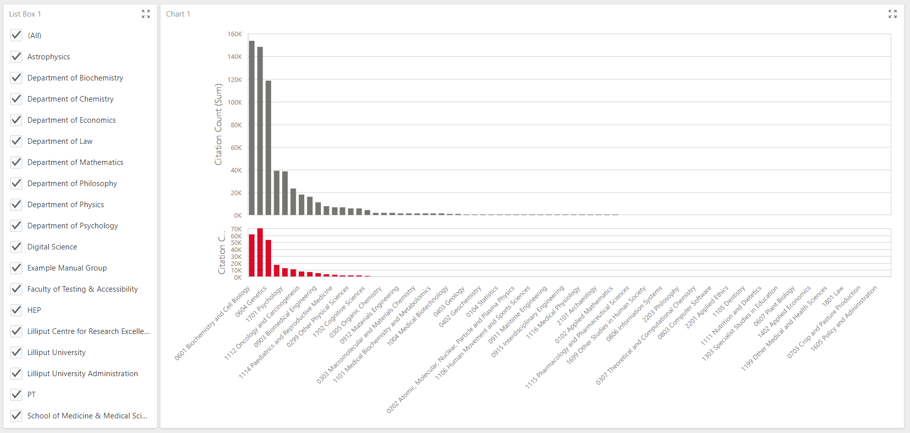
Add a chart to your dashboard and bind its values to the Citation Count (Sum) data value, and its arguments to the Label data value. Adjust the Label binding options to order the labels by Citation Count (Sum), descending.
Now add a list box to your dashboard. Bind its dimensions to the Group data value. You should now see something like this:
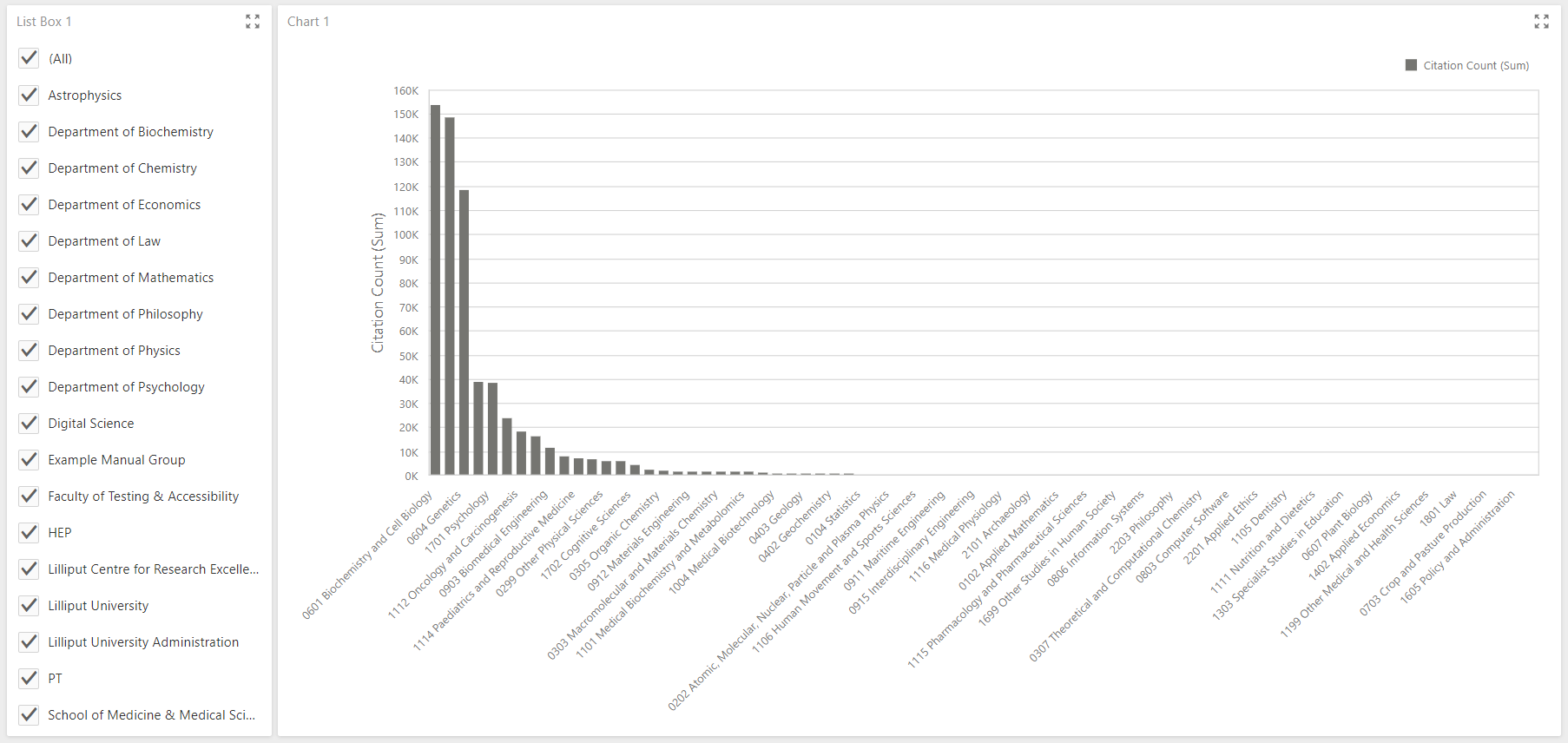
It may look like it is summing citation counts for the publications that apply to each bar (where those publication are filtered by whether or not they are claimed by a user in any of the selected groups), but for each bar, the summation is actually summing citation values for multiple instances of the same publication, since the publication appears in as many rows as there are valid group memberships for each user who has claimed the publication.
To fix this, add a new pane to the chart (the little "chart-plus" icon above the Values section of the binding configuration for the bar chart) and bind the second pane's values to a new calculated field (the little "f-plus" icon above the available field list when binding to the data query). Name the calculated field "Citation Count of Distinct Publications" and set its definition to "Aggr(Min([Citation Count]), [Publication ID])".
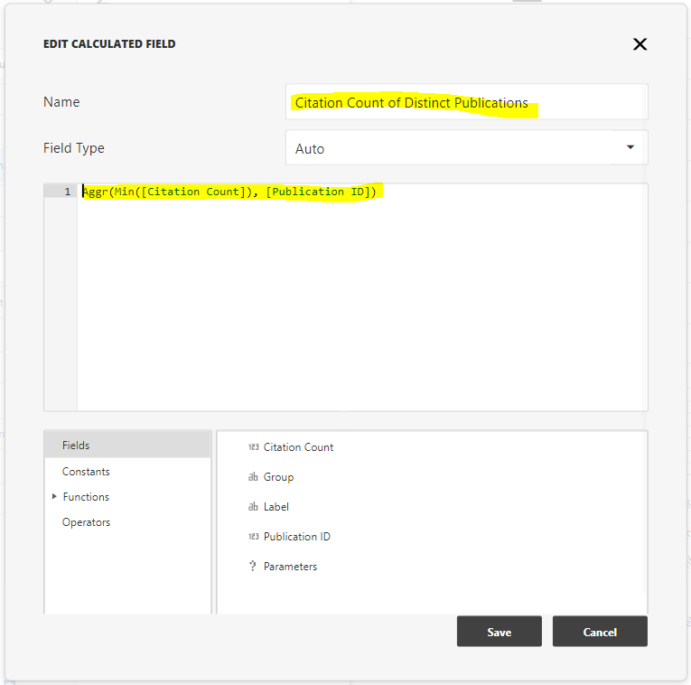
This defines our new calculated field as an intermediate aggregation: the minimum value of citation count values, grouped by publication ID. Then ensure the Sum summary type is chosen to sum these intermediate values.
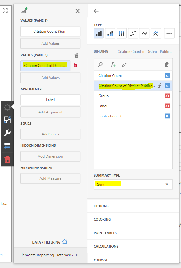
You now have a comparison of the wrong (top) and right (bottom) ways to sum the citation counts of publications associated with each Fields of Research label, while simultaneously filtering by associated claimed user group memberships. You can see that the top pane over-counts the same publication again and again. The bottom pane does not.
Drilling down
Dashboards support the idea of interactively drilling down through hierarchical dimensions to analyse data at finer levels of granularity. A good example of a hierarchical dimension is your institution's group structure, which we will assume is organised from the institution at the top, through to its schools of research at the second level, to its departments at the third level.
Create a new blank dashboard, connect it to the Reporting Database and register the follow SQL query for use within the dashboard:
SELECT  p.ID AS [Publication ID],
    CASE WHEN g.Depth < 3 THEN NULL ELSE g.[Level 3 Group Name] END AS Department,
    CASE WHEN g.Depth < 2 THEN NULL ELSE g.[Level 2 Group Name] END AS School,
    g1.[Name] AS Organisation
FROM  [Publication] p
    JOIN [Publication User Relationship] pu ON pu.[Publication ID] = p.ID
    JOIN [Group User Membership] gu ON gu.[User ID] = pu.[User ID]
    JOIN [Group] g ON g.ID = gu.[Group ID]
    LEFT JOIN [Group] g1 ON g1.ID = 1
This query reflect the assumptions above, and returns a row for each publication, for each user who has claimed that publication, for each group membership of that user. The values returned by the dataset include the publication ID as well as the corresponding level 1, 2 and 3 group membership indicators. Note that the top-level group always has an ID of 1 in Elements.
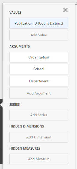
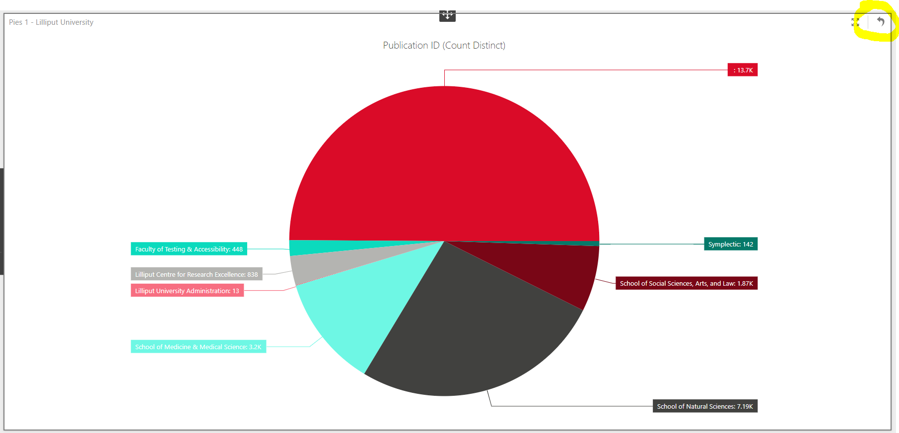
Create a pie chart and bind its values to Publication ID (Count Distinct). Then bind the the chart's arguments to the Organisation, School and Department data columns. Finally, switch to the Interactivity context menu for the pie chart, and switch Drill Down to On. Open the Options menu for the bar chart and select the Argument and Value option in the Data Labels section to cause the pie chart to display absolute publication counts instead of percentages.
Try clicking on the pie chart to drill down to the next lowest level in the hierarchy. You will see the pie chart replaced by a breakdown of publication counts at the school level. Click again on a school to see that school's publication count broken down further by department. You can dill back up again by clicking the Drill Up button at the top-right of the pie chart visualisation.
Use of drill-down can be a good way to help end-users explore data, though getting the experience exactly as you want it can be a little tricky - some degree of skill at defining the required SQL queries may be necessary. When used in combination with making your drillable visualisation act as a master filter for the dashboard (see Interactive Filters, above), this can be a powerful tool.
Watch out though, it is easy to write a poorly performing dashboard when attempting to implement drillable visualisations:
Drilling through to underlying data
It can be invaluable for a number of different reasons to be able to reach through to the underlying data relevant to a dashboard. We provide an example of a flexible way of doing this.
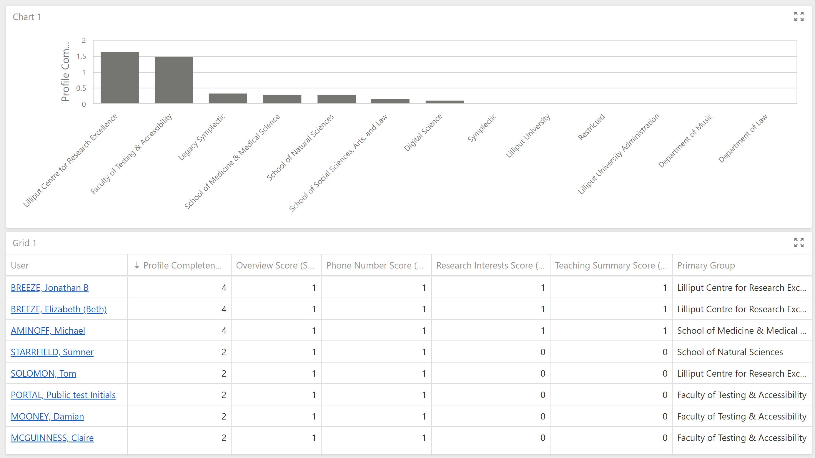
Suppose your institution hopes to improve overall levels of profile completion by its researchers, perhaps in order to provide fuller data to a public-facing researcher profile system. In order to do this you might want to focus on those researchers with the least complete profiles. Create a new blank dashboard and configure a Reporting Database connection with the following query:
SELECT	[Computed Name Alphabetical] AS [User],
		[Primary Group],
		CAST([Overview Score] + [Research Interests Score] + [Teaching Summary Score] + [Phone Number Score] AS DECIMAL) AS [Profile Completeness Score],
		[Overview Score],
		[Research Interests Score],
		[Teaching Summary Score],
		[Phone Number Score]
FROM
		(SELECT	u.[Computed Name Alphabetical],
				p.[Name] AS [Primary Group],
				CASE WHEN r.overview IS NOT NULL THEN 1 ELSE 0 END AS [Overview Score],
				CASE WHEN r.[research-interests] IS NOT NULL THEN 1 ELSE 0 END AS [Research Interests Score],
				CASE WHEN r.[teaching-summary] IS NOT NULL THEN 1 ELSE 0 END AS [Teaching Summary Score],
				CASE WHEN EXISTS(SELECT 1 FROM [User Record Phone Number] WHERE [User Record ID] = r.ID) THEN 1 ELSE 0 END AS [Phone Number Score]
		FROM	[User] u
				JOIN [User Record] r ON r.[User ID] = u.ID
				JOIN [Group User Membership] ug ON ug.[User ID] = u.ID AND ug.[Is Primary] = 1
				JOIN [Group] p ON p.ID = ug.[Group ID]) AS Users
This selects some basic measures of user profile completeness for each user. Note that no attention has been paid to security in this example. In the real world you would likely wish to take account of a user's privacy flags on their various profile fields, and the privacy flag on their profile as a whole. Please see the following article for more information about privacy and dashboards:
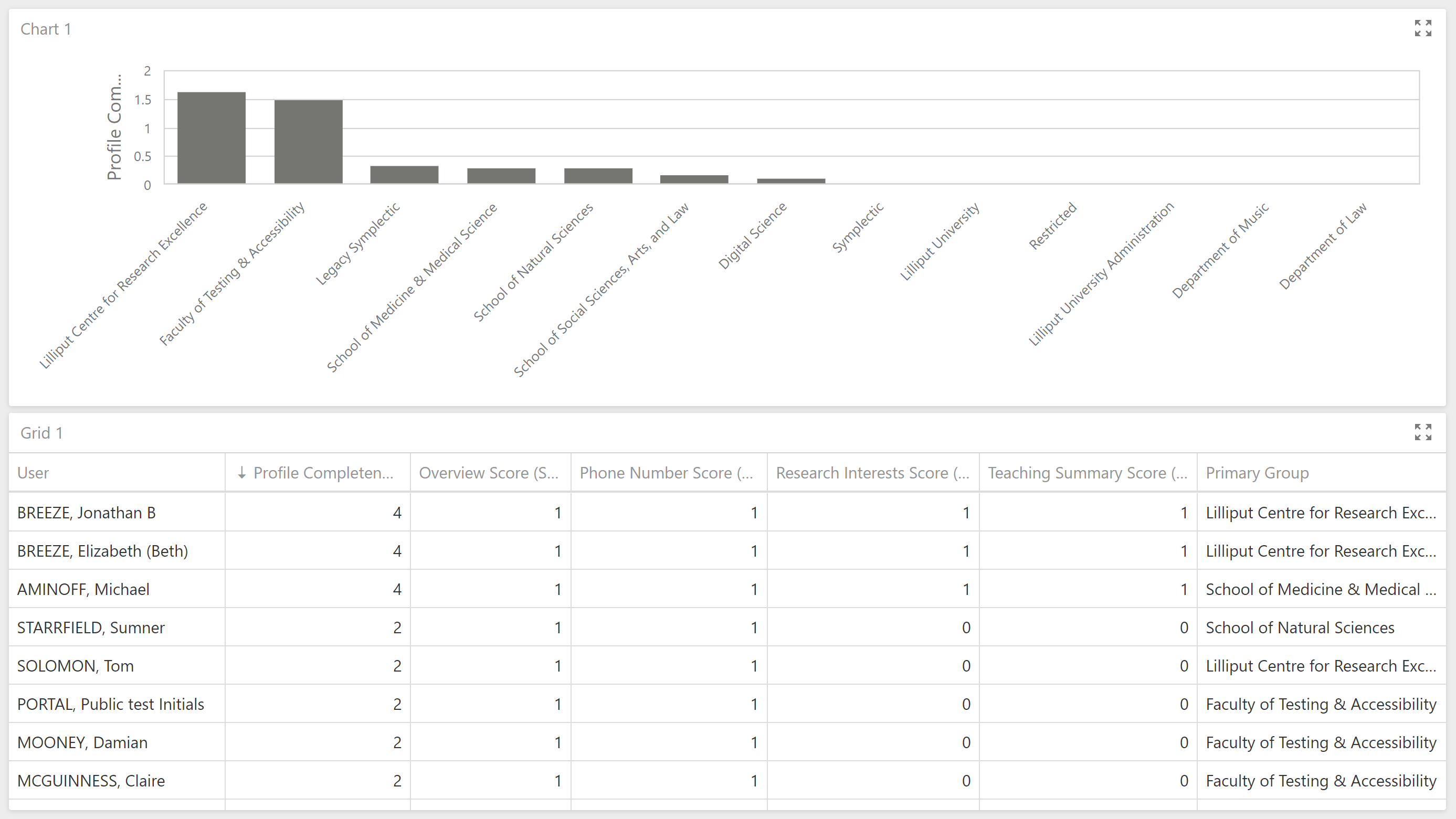
Add a new bar chart to the dashboard and bind its values to Profile Completeness Score (Average), then bind the chart's arguments to the Primary Group data value, altering that binding's Sort Order to order bars by Profile Completeness (Average), descending.
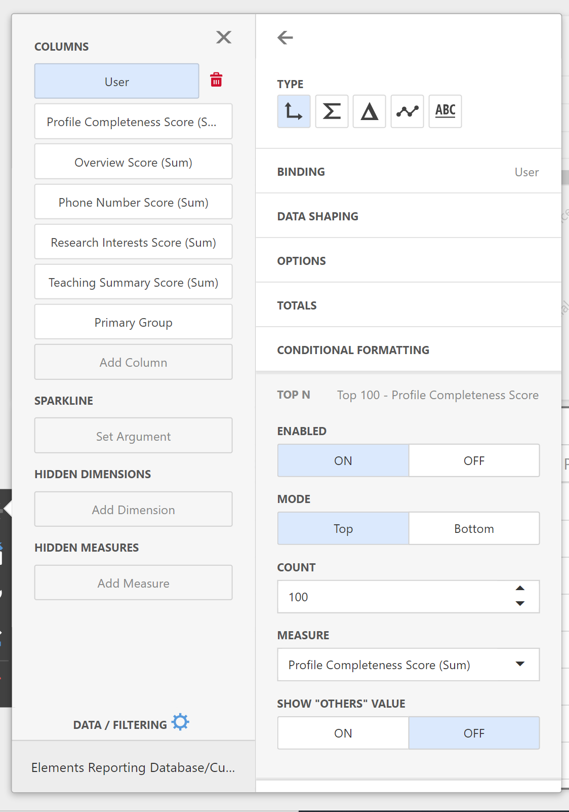
Add a new grid item to the dashboard and binds its columns to all of the columns in the query. Ensure the grid does not display more than 100 rows by configuring the User binding to show the top 100 users by Profile Completeness Score (Sum). It is important to ensure a dashboard does not have to show too many rows or too many data points. If you need to be able to export a very long list of data, you should consider using a custom SSRS report for your needs instead of a custom dashboard.
Incidentally, you may notice that your grid bindings are by default using the "Sum" aggregating function for many of the bound columns. But since we have bound the User column as a dimension of analysis (Type selected as the small axes symbol) and each row in the results set represents a different user, these aggregations perform no significant action as they will be aggregating over a single value.
You will now have a dashboard looking something like the following:
We wish to be able to drill through to the actual profile data for each user, so that we might review it in more detail. We can implement this using hyperlinks to pages in Elements. Edit your initial query and replace it with the following, which provides us with the base URL of the Elements web application.
SELECT  [Computed Name Alphabetical] AS [User],
    [Primary Group],
    CAST([Overview Score] + [Research Interests Score] + [Teaching Summary Score] + [Phone Number Score] AS DECIMAL) AS [Profile Completeness Score],
    [Overview Score],
    [Research Interests Score],
    [Teaching Summary Score],
    [Phone Number Score],
    [User Url]
FROM
    (SELECT  u.[Computed Name Alphabetical],
        p.[Name] AS [Primary Group],
        CASE WHEN r.overview IS NOT NULL THEN 1 ELSE 0 END AS [Overview Score],
        CASE WHEN r.[research-interests] IS NOT NULL THEN 1 ELSE 0 END AS [Research Interests Score],
        CASE WHEN r.[teaching-summary] IS NOT NULL THEN 1 ELSE 0 END AS [Teaching Summary Score],
        CASE WHEN EXISTS(SELECT 1 FROM [User Record Phone Number] WHERE [User Record ID] = r.ID) THEN 1 ELSE 0 END AS [Phone Number Score],
        g.[Website Base URL] + 'userprofile.html?uid=' + CAST(u.ID AS VARCHAR) + '&em=false' AS [User Url]
    FROM  [User] u
        JOIN [User Record] r ON r.[User ID] = u.ID
        JOIN [Group User Membership] ug ON ug.[User ID] = u.ID AND ug.[Is Primary] = 1
        JOIN [Group] p ON p.ID = ug.[Group ID]
        CROSS JOIN [Global Settings] g) AS Users
The query above uses the knowledge of the base URL in the Reporting Database to construct the URL to each user's Elements profile page. You could construct any URL you like, as long as you know the URL's structure and you have access to the user-specific data values that must be substituted into the URL.
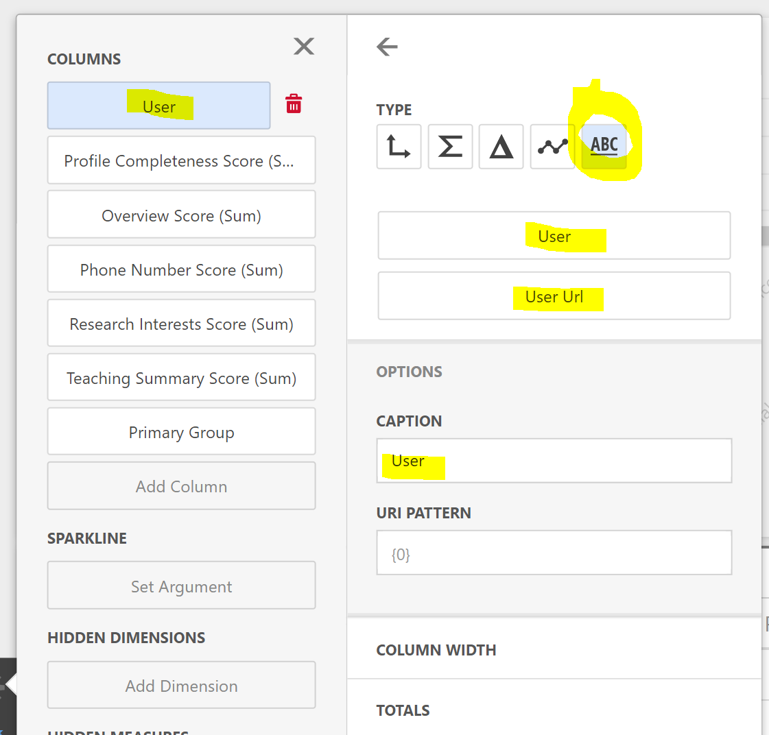
Go back to your data bindings for the data grid and select the User column binding. Switch its Type from Dimension to Hyperlink (The "ABC" button), then bind the User Url query column to the Url placeholder box. This instructs the grid column to get its display value from the User query column but its hyperlink URL from the User Url column. Finally, set the binding's caption text to "User".
Your dashboard is now able to drill through to the data underlying the dashboard (or at least, data representing the first 100 rows). This type of drill-through is very powerful, especially when you consider the possibility of hyperlinking to other reports or dashboards while passing varying report or dashboard parameters to them as query string parameters. During 2020, Symplectic plans to support stable URLs for an increasing number of types of report for just this reason.
As an exercise, why not configure the bar chart above as a master filter for the dashboard, such that selection of a bar causes the table to restrict to those user in the selected primary group?
GRID data and maps
With a subscription to and integration with the Dimensions data source, Elements automatically resolves addresses found in bibliographic data to GRID IDs. Without this integration, the data required within Elements for this type of dashboard is not present, and will result in empty map visualisations.
Dashboards offer several ways to visualise data on maps. We will run through one example. Let's suppose we wish to visualise a simple measure of collaboration: the number of publication collaborations with institutions around the world. Create a new blank dashboard, connect it to the Reporting Database and register the following SQL query for use within the dashboard:
SELECT  DISTINCT g.[Name] AS [Primary Group],
    p.ID AS [Publication ID],
    a.[GRID ID],
    a.[GRID Institution Name],
    ISNULL(a.[GRID Institution Type], 'Unknown') AS [GRID Institution Type],
    CASE a.[GRID Institution Type]
      WHEN 'Education' THEN 1
      WHEN 'Company' THEN 2
      WHEN 'Healthcare' THEN 3
      WHEN 'Nonprofit' THEN 4
      WHEN 'Facility' THEN 5
      WHEN 'Government' THEN 6
      WHEN 'Other' THEN 7
      WHEN 'Archive' THEN 8
      ELSE 9 END AS [GRID Institution Type Number],
    a.[GRID Latitude],
    a.[GRID Longitude]
FROM  [Group] g
    JOIN [Group User Membership] gu ON gu.[Group ID] = g.ID AND gu.[Is Primary] = 1
    JOIN [Publication User Relationship] pu ON pu.[User ID] = gu.[User ID]
    JOIN [Publication Record] r ON r.[Publication ID] = pu.[Publication ID] AND r.[Data Source] = 'Europe PubMed Central'
    JOIN [Publication Record Person] p ON p.[Publication Record ID] = r.ID
    JOIN [Publication Record Person Address] pa ON pa.[Publication Record Person ID] = p.ID
    JOIN [Address] a ON a.[Address Hash] = pa.[Address Hash]
WHERE  a.[GRID ID] IS NOT NULL
This query selects one row per primary group per publication claimed by a member of the primary group per GRID institution resolved to an address appearing in the publication's Europe PubMed Central bibliographic data.
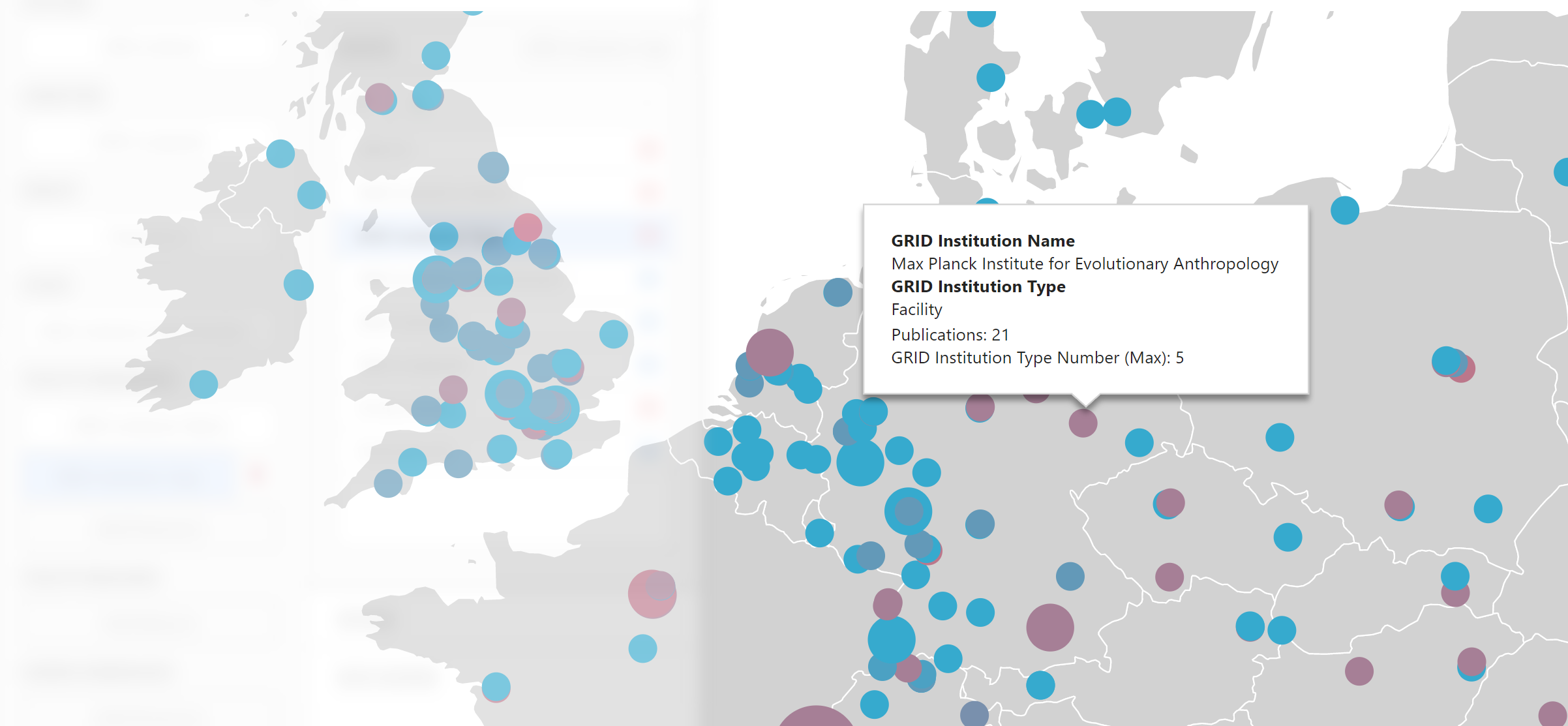
Add a new Bubble Map dashboard item to the dashboard and bind the GRID Latitude and GRID Longitude query columns to the appropriate map property placeholders. Bind Publication ID (Count Distinct) to the map's Weight placeholder, setting its caption to "Publications". Bind the GRID Institution Type Number query column to the map's Colour placeholder. Bind the GRID Institution Name and GRID Institution Type query columns to the map's Tooltip placeholders. In the map options menu, choose the Europe map. Use the mouse and the mouse wheel to pan across the map and zoom in.
We very quickly have a completed bubble map visualising the number of publication collaborations with institutions across Europe, coloured by collaborating institution type. Improvements to this dashboard might include adding drop-downs to allow you to filter by institution type and primary group. Variations could include weighting by the total citation count of the joint publications instead of simply counting them.